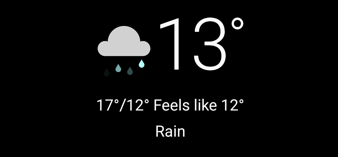
So here we had a weather APP which allows to add different locations for quick check of weather conditions around my preferred places. This was doable by just swiping through my prechosen list of towns and cities around the world or countries.
But “back to the past” – suddenly with one update the usability was changed – a hamburger menu appeared on the screen of weather APP and no more swiping. Now we need to click on the hamburger menu button to open a menu of locations.

And then click again to open the desired location weather information. And if you want to check other places go through the clicking process again and again. Why the hell must it be so complicated!? Well, I agree to that a hamburger menu is a nice addition to swiping and checking on the list in a list view but in no way it is a replacement to a fast interaction on a mobile screen.

Indeed to be correct the swiping still exists here. A swipe to the left opens a web browser with more weather information on the currently open location and a swipe to the right opens the hamburger menu content. Still the browser link can be opened (also currently available) via a push on the location area of the screen and that is enough.
To better understand swiping take a look at a popular app called TikTok for example – via a swipe up a change to next video happens. Indeed, on swipe left I get more info on that user but I am not taken to some other APP around the corner.
In conclusion the weather APP is missing a way to easily swipe to next or previous location without the need to open a context menu. Of’course the context menu on itself is a good way to go and an accessibility addition to the functionality. Still do not loose easy swiping as an alternative for those more used to it.
Also check out Power of the Swipe: Why Mobile Websites Should Add Horizontal Swiping to Tapping, Clicking, and Scrolling Interaction Techniques